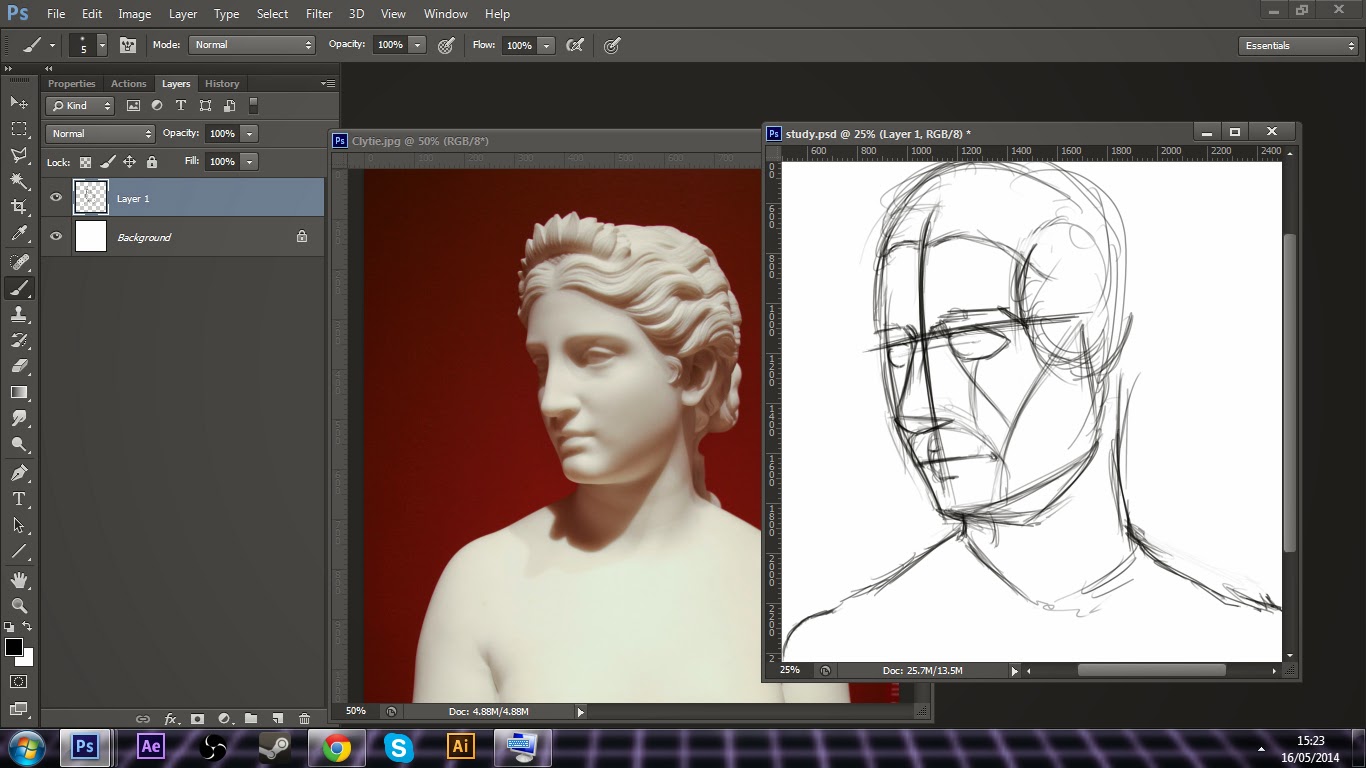
The intention here is to simply give the individual an insight into how this particular artist works. Remember however, that there is no one way to approach any artistic endeavour. This is merely to provide an example, to hopefully give some folks an idea of the building blocks that go into the creation of an artistic piece, or in this case, study. With any luck, if my tutorials gain any popularity, it'll open the doors to more discussion. There's few things I enjoy more than talking art with passionate people, and sharing what humble amounts I know on the subject with passionate learners.
So let's get started! Today I'll be doing a study of Hiram Powers bust of Clytie, a water nymph in ancient Greek mythology.
To begin, I'll show you how my workspace is arranged. I don't have the luxury of a second monitor (I had one, but I traded it for a Pterodactyl), so I'm forced to keep a very tidy work area within Photoshop. There's no tracing, sight sizing or lining up going on at any point, it's simply 'draw what you see'. These days, I tend to skip over entire head construction. You can see where I've constructed the front side of the face with measurements, this is to make sure everything is proportionate and consistent with the rest of the face. I'll realize at some point that the head is facing a little too forward, and fix it later. At this stage, accuracy is key, and head construction is something I'll go into in a later blog hopefully.
Now I'm moving further in and building up the construction of some of the features. It's important to start with large, simplified shapes to get the general form of each feature. Try not to jump into each minor, individual detail. You're trying to coax a complex life form out of the canvas, a whole. At this point, I'm thinking purely in shape and planes.
Now that I'm happy with the general shape of the head (despite the face direction being off by a few degrees towards the viewer), I'm starting to detail some of the major features. In terms of absolute accuracy, I spend a lot of time in my early artistic study trying to get deadly accuracy in size, shape and colour of study. While I was able to achieve it, quite honestly I found it took a lot of creativity from me and no longer became something I enjoyed. So at this stage I like to take my studies in directions that I think will benefit me. Pretty much always, it's shadow and light that draws me. I start to define where some of the cast shadows will fall and clean up the construction.
Further refinement and shadow work. I'm now painfully aware that the direction of the head is off, so using the liquify tool I attempt to make the head a bit more plumb with the reference. I start to realize how difficult this is, and upon learning that it's not an arrestable offence, I leave my fate to the gods and continue regardless.
Now I'm starting to create an underpainting, using contrasting colours. This is a habit from when I painted traditionally, and doesn't apply quite as well to digital, but I enjoy the effect anyway. Further refinements to the drawing, I'll make with paint from this point on.
Now I'm starting to block in light and shadow, making note of where the reflected light falls (in particular, below the chin, below the nose and below the eye socket). This will act a guide when I begin to paint proper. I'm noting where the shadow depends and making landmarks, and picking out the angles in which the light hits directly, and in my head, working out the percentages of which angle is receiving which percentage of light. Over time, the values will even out as the bounce light, shadow falloff and hue is more refined.
That does it for part one. Hopefully this has been helpful enough for you to give a look at part two and the finished piece. If anyone has any questions, feel free to ask!
Follow me on twitter @QuothTheRaven2 where I'll be putting up more mini-tutorials and fun game dev/art stuff. Thanks!


