Monday 21 October 2013

Pokemon Wallpapers

So after playing the new pokemon game I finally figured out my favorite one (it's been a while). I made a few wallpapers in Illustrator with some different colour schemes, and a couple of android wallpapers to go with it!


Wednesday 9 October 2013

Batman Process

Been trying to calm the shakes with some comic artwork. This is pretty much the first time I've ever attempted anything in this particular style, so it was quite a learning experience. Here's a process sequence.


Tuesday 1 October 2013

Friday 6 September 2013

Robocop brought back from dead (for some reason)

I'm something of a fan of the 1980's. I was born in it for example, allowing my very existence. That's pretty vital. So was my wonderful and better half. That's also pretty vital.

I was of course too young to be part of the zeitgeist and pop culture of the decade, so being a child in the middle of the 90's allowed me to experience the era in a filter. That lead to me growing up with some movies that I utterly fell in love with. Like every era it had it's defining symbols, and one of the many of the decade was the gloriously over the top action movies and the even more gloriously outrageous personalities it gave us. There's a very unique feeling to action films of the age, almost like tongue in cheek comedies played straight. And one of my favorites was Paul Verhoevens 1987 Sci-Fi action/satire Robocop.

"I am the law!"(Shit, wrong movie..)
It's a ridiculously violent and silly satire on a number of themes. American culture is at it's heart, satirizing on corporate greed, authoritarian police, crime, base media (what a prediction that was!), and dehumanization among other things. While I never would have guessed from my own viewing, the director even cites it as something of an allegory for Christianity, with Murphy depicted as a Christlike figure risen from the dead.

There's some seriously deep stuff going on here.
Like this guy. Look how fucked he is. Deep.

One of the best parts of a film is discussion, more specifically discussion on the issues or themes they bring up. I love a film with layers. On the surface Robocop is a silly and generic action film. Fun to watch. On a deeper level for those who want to explore it, there's all sorts going on. None of which I could detect in this recently released trailer for the reboot. It would appear that many of the key plot points of the original are being glossed over, ignored, or changed. Isn't it kind of important how he was brutally killed in the original? Here it's a bomb. His complete isolation from his humanity and his family, resulting in a key scene in which he explores (literally) the memory and home of his former, happier life? Well he can't stop screaming his lungs out here, and his wife seems fully aware. The design of the suit looks like a bloke in a rubber gimp suit. His pretty face is on show most of the way through too. At least Karl Urban had the decency to keep his Judge mask on. Here's the trailer.


It's early of course, and it would be unfair to judge an unreleased film on it's trailer alone (even if that trailer paints it as a pointless piece of a McMovie). Just promise me one thing. If this film *does* turn out to be a huge piece of crap, will you all skip it and go buy another copy of Dredd instead?

Thankfully at least one thing outside the film got it's satirical theming right. Check out this Korean advertisement for fried chicken. It really hit on that brainwashed consumer culture vibe. And Robocops enjoyment of fried chicken. Not sure he'd be down with stealing somebodies fridge though...


I'd buy that chicken for roughly one pound.


Tuesday 5 March 2013

On the topic of value


Many of the finest artists of contemporary times consider one aspect of art to be far and above the most important part of a strong piece. Without an understanding of value, we cannot create art that shows form or depth to a satisfactory degree, and our work will appear flat and dull. It's a huge subject, and an even more difficult one to master (something I will no doubt spend a lifetime trying to perfect myself) but a simple one to get a grasp of.

Self portrait of artist Artemisia Gentileschi, a beautifully crafted
example of the manipulation of value to create a striking and realistic artwork.


Put simply, value is the term we use to describe an objects relationship to light. Known also as 'tone', value communicates to us where an object sits on a black/grey/white scale. It shows us the form (3-Dimensional shape), depth and distance of an object. If line drawing is 2D, value is what we use to make our paintings come alive in three dimensions!

Object painted entirely with value, with exaggerated bouncing lights.


We will get into the mechanics of light and how it works next time, but for now, let's just figure out what it does, and how that applies to art. Light and shadow affect all that exists around us. It communicates much of what we interpret visually, and every single one of us has a deep and inborne understanding of it on an instinctual level. We will refer to strong light as 'high' value (closer to white) and 'low' value as darkness (closer to black). The overall composition of a painting will betray to us the light sources involved and their position, but more importantly, it can greatly influence the mood, intention and symbolism of an artistic work.

Venus, depicted by William Bouguereau. A fine example
of high value, communicating a heaven like presence... 
..In comparison to Christ by Francisco Goya, an
example of an overall low value painting, with light being
used strongly in areas for contrast (Chiaroscuro)

It's also worth noting that even in neutral light, every object has it's own inherent 'local' value. Colours exist on the value scale like anything else, hence why we refer to something as 'dark blue' or 'light green'. With this, we can predict (through practice) roughly where something will sit on the value scale even without seeing it in black and white. Because of this, if we remove all of the colour from the world around us, we could still exist quite happily within it, as value is the thing we use most to perceive the world around us.

A chiaroscuro painting (San Gerolamo by Caravaggio), upon removal of
colour, we can inspect the individual local values of each object. Clearly, the
white of the cloth and bleached yellows of the skull are higher on the value
scale than that of the dark brown table, but note the warm tones of his skin
in comparison with the red cloth.


The strength of the value of something is dependent on the strength of the light that falls on it. As we will explore more in depth later on, the side of an object that faces the light, will be lit relative to the strength of that light, and it's own local value. Therefore, if we place two identical objects side by side in the same lighting situation, the light that falls on them *must* be consistent. Likewise, if one object has a higher or lower local value than the one next to it, then that must be reflected in it's value. There is a 'cheat' that we can use to get a better grasp of this, which I will reveal in the next entry.

In this example, I have quickly painted a cube with a single local value,
but with a corner segment that has a lighter local value. Since the lighting and relative
values remain consistent, this tricks our eye to seeing a solid 3D shape in a lifelike environment.

Wednesday 13 February 2013

WoW commission


Commission piece for a World of Warcraft character, minus the flak that will go around it.


Saturday 2 February 2013

Comics and Dedicated Site


I have a new dedicated website for my comic uploads, which you can find here.

Just uploaded a new comic, and coloured a previous one. If nothing else, they're helping to keep me somewhat sane at the moment..If the image is too small, just click on it so it expands, and then right click on the image and select 'open in new tab/window'. That should make the text more readable :)


Wednesday 30 January 2013

Templar

Learning new art styles and experimenting provides quite a nice distraction.


Tuesday 29 January 2013

Detective 19

The PC I'm using to paint with isn't powerful enough to allow me to create the kind of  drawings I would normally make, so I'm having to come up with more 'graphic design' style things. I've never tried to make something like this before, so the entire thing was quite a learning experience. Fun though!


Sunday 27 January 2013

Self Reflection

Some sketches I was able to do this afternoon, Sunday sketches, if you will!


Annnndddd...I tried my hand at a webcomic of some description. When you're drawing something for half an hour, you don't recall whether you found the original idea funny or not anymore :/


The hardest part is choosing the layout. Having never made a comic before, it seems the presentation is an art in and of itself!


Friday 25 January 2013

Basic Perspective Pt.1


So..the creation of art begins with one simple thing, and that is perspective..


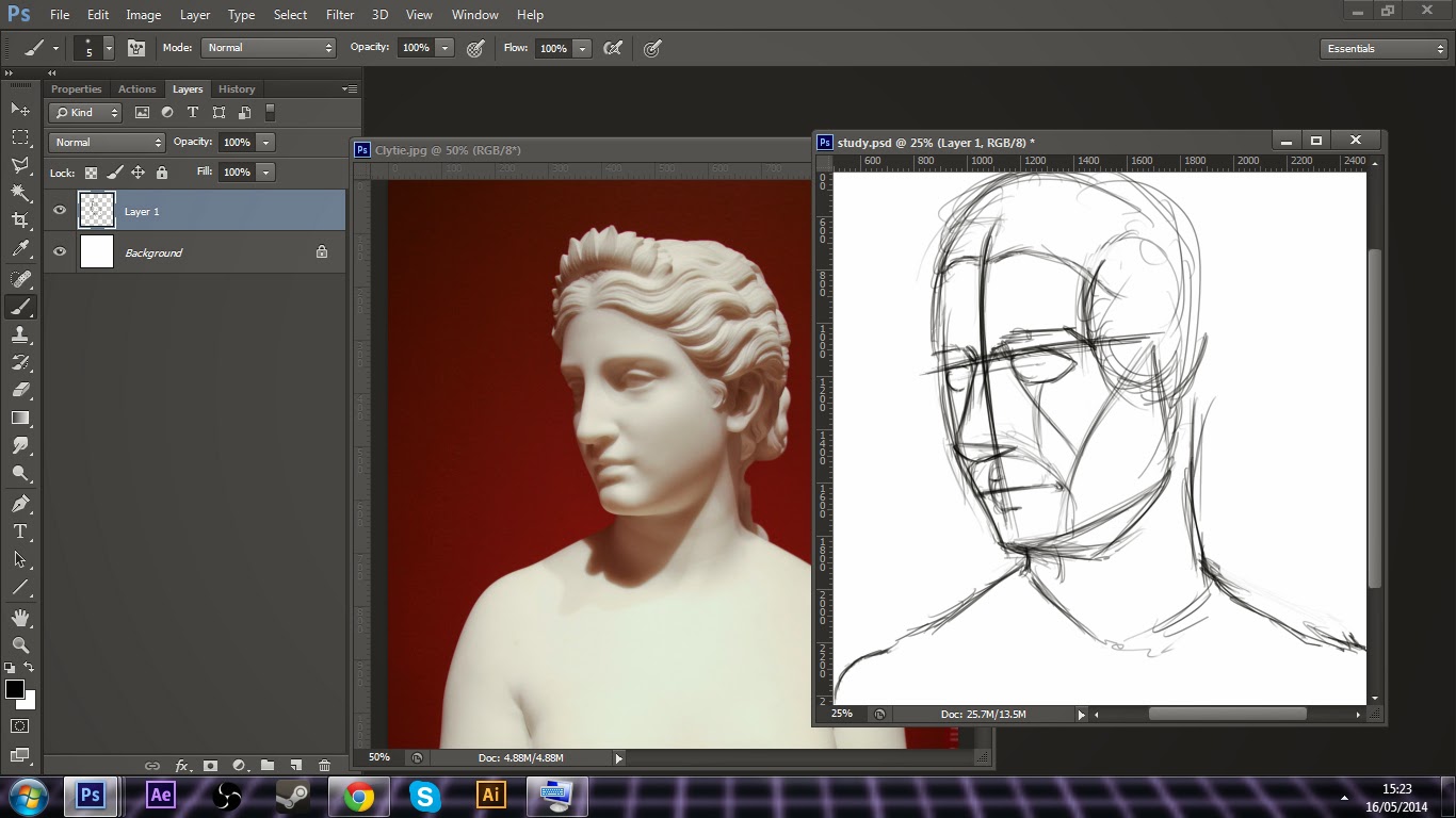
A vehicle created utilizing 2 point perspective

What is perspective? Well, perspective is our perception of one or several objects in space. Perspective tells us the distance, spatial relativity and dimensions of an object. If two people are viewing the same object or landscape, one with his face to the ground, and the other from a helicopter, both will see that object or landscape in an entirely different way. It is probably the absolute base foundation of good art, and while difficult to master, it thankfully follows some strict mathematic rules that once digested, will become second nature to you when calling upon it to create your art.

So let's look at the components of perspective..


4 hours in MSPaint that took..


This is our horizon line. Now there's something extremely interesting about this line, as no matter where we stand or place our 'camera' (visual camera that is, not necessarily a physical photo camera (though it can be that too ;)), as long as we face directly forwards, the horizon line will *ALWAYS BE AT EYE LEVEL*. Try it yourself, if you live in a place with a clear or roughly clear view of the horizon. If you stand outside your door, the horizon line will be at eye level.  If you then go up a high rise apartment building and look out your balcony, the same will occur. Since the horizon line will always be at exactly eye level (assuming you're not tilting your head or camera), then anything below the horizon line, you will be viewing the top of...and anything above it, you will be viewing the bottom side. Again, try this...look around your living room. Grab a cup or a DVD box and slowly move it around your field of vision, and observe what you see.

Now the majority of the time, the horizon line will not be directly visible, instead obscured by foliage or buildings. But in perspective drawing, the horizon line is essential for the next step.


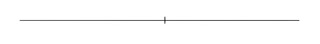
4 and a half hours..


Now this dot here is what is known as the vanishing point. The vanishing point is the point at which things vanish (stay with me here :o). What we mean by this, is that at this dot, we can no longer see any further past the horizon. If we draw perspective lines outward from that point, we have our first type of perspective, 'one point' perspective.


These lines can be used as a grid, or could either represent a road, railway or a rigorously rigid river (good band name there). That doesn't matter. What does matter is that when held up to scrutiny, the perspective fits, and our brain will see the reality in that which we're trying to represent. After all, we're not creating our own rules of nature and getting our viewer to conform to them. Nature's rules are solid, and we all share the same perception of the world around us to one degree or another. Understand the rules of nature, and you're free to bend them to your whim.

So let's begin, the image below should provide a step by step towards creating a cube form within the dimensions of one point perspective.

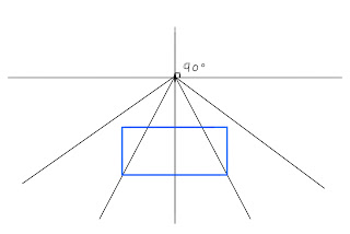
Draw a box, this will be the front side of your cube, and the plane (side) closest to us
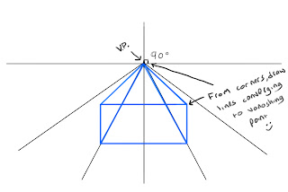
From each corner, draw a line to the vanishing point

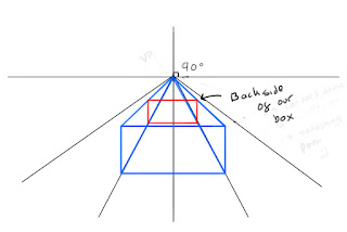
Now we're going to draw in the back side of our cube. Even though we couldn't see this in a finished render (unless we were drawing a see through material of course), drawing things in wireframe helps us to understand

Draw in the parts of the box we would see, and there we have a finished cube form in one point perspective


We can use the same process to draw in many more cubes, including the cube in the top right at an angle. Just keep the lines parallel


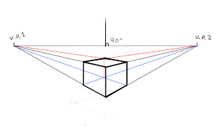
Once you've gotten the hang of that, the next step is to create a second vanishing point. This is shockingly know as 'two point perspective'. A general rule of thumb here is to place your points quite far apart from each other. Place them too close and you end up with some distortion problems.

Let's attempt something more difficult, but something that is really the first significant step in mastery of form. Let's construct a cube in 2 point perspective.

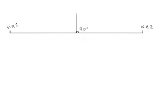
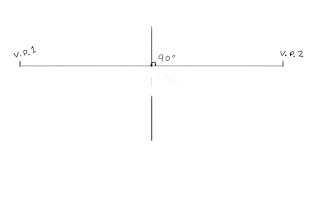
Add in your 2 vanishing points
Draw a stick (sticks are going to be important later on, learn to love them)
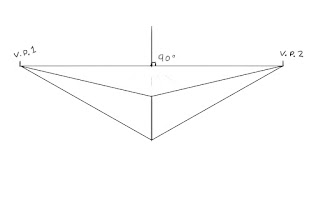
From the top and bottom, draw lines to the V.P
Close off the side planes of the box. It doesn't matter if you're making a cube or a cuboid, but for the sake of it, just stick with a cube for the time being
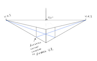
Now the back sides of our cube. Always think in wireframe at this point
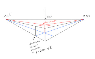
Continue, now draw the lines to make up the top side of the cube
Go over the lines to bring out the visible planes of the cube

Now a good exercise here is to continue building cubes all over the page. Try placing one in front of the other, or one on top of another etc. Remember always that all parallel lines will converge to the same point in space. You can construct cubes on the same construction lines as another, up and down, but in order to have then appear parallel, they *must converge to the same point*. The more you do it, the more you will begin to understand how a cube would fit into any given perspective.


That's all for the moment. Some exercises will be presented in the next part. If anyone reading this would like to contribute their attempts, I'd love to see it and post some here. If there are any questions or any need for clarity on any given subject, don't hesitate to let me know! 

Wednesday 23 January 2013

Where to begin?


Art is large subject to take on. So, like anything, it's best to understand it at Its most basic and simple core before moving onto the more complex aspects. It could be argued that everything in art begins with the line. As children, we would draw flat illustrations of what we thought we could see, in it's most simple line art form. More a symbolic representation of the object or person we were drawing than an attempt at realism.


An adults (mine) attempt at a child's drawing :/


But really, in order to accurately portray something in a realistic, conceptual or expressive fashion, then form becomes the most important thing you can learn in order to understand how to draw or paint something. So then what is form?


The image above displays the most basic examples you can get of form. Every physical object is made up either of these shapes directly, or some kind of variation. The more complex the construction, the more variations and 'shapes on shapes' will be. But you can't understand something by diving headfirst in to it. By far the best approach is to learn to simplify something so that your brain can wrap it's head around it (er..that conjures up a disturbing image actually...), and understand it's shape in a 3 dimensional platform. Every object we can draw is made up of, or can be broken down into, basic forms. Let's see if we can find some examples...


Cubes make up the majority of our urban landscape. Other forms are in red.

The ribcage can be simplified into a box, while the hips resemble more of a trapezium. The legs and arms are obviously cylinders.

They're a little crudely drawn, but hopefully you get the idea. I'll go a little more in depth on this subject in the future, specifically in regards to anatomy and facial features. If we learn to simplify forms, we can better understand them and begin drawing from our heads. Even better, once you've mastered the basics of applying light and shadow to simple forms, that understanding can translate directly over to complex and realistic figures and objects, allowing you to visualize these goings on in your head and throw them directly onto the paper!

So now that we understand *WHY* we are learning something, next is to actually perform the exercises that will teach us how to draw. And since we're starting at the beginning, that will be basic perspective and learning to draw forms in perspective. And that will hopefully be my next tutorial blog post :) Thank you for reading!


All photos are taken from either wikipedia or character design. All drawings were done by me. The eye I painted was used from reference, with permission from DeviantArt user AFKBrandy. Thank you AFKBrandy :)


Artistic Study Tutorial: Part 1

Thank you for taking the time to check out part one of my tutorial. Whether you're a beginner or advanced artist, I sincerely hope that ...